


Today, we have the pleasure of talking to two passionate app developers from Optimile who, together with their team, have transformed our Mobiflow mobility app into an indispensable companion for modern travellers.
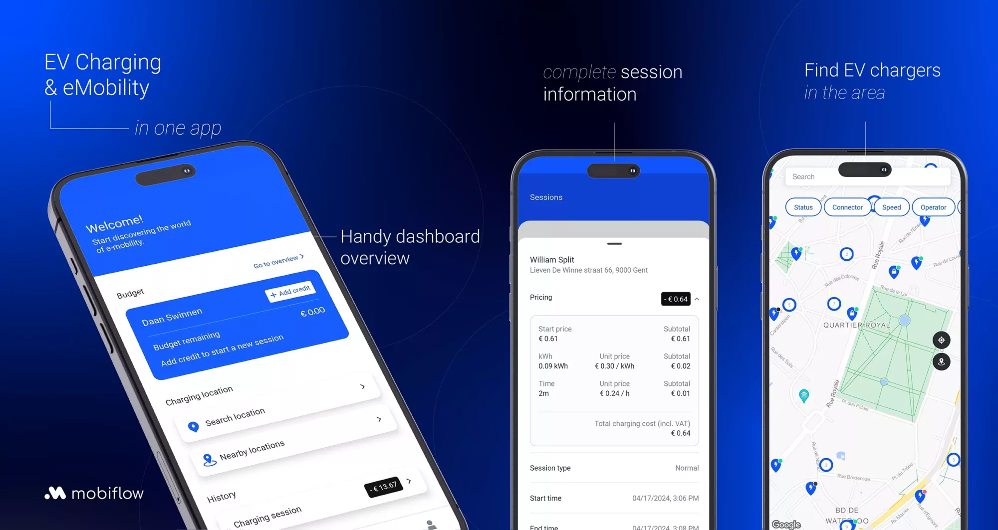
The app, available for free as from April, 26th on both the Google Play Store and Apple Store, revolutionises the land of mobility apps. With a few simple taps on the screen, the app provides direct access to a range of mobility providers for purchasing train and bus tickets, for example. But that’s not all. The revamped app goes beyond booking mobility tickets. It helps build the future of electric driving by helping users find the nearest charging point, including prices and availability. Not only does the app provide finding charging points, it allows users to easily manage their charging sessions and budget. A charging session can be effortlessly started and stopped via the app, all within the same intuitive interface.
We are therefore curious to get to know the developers behind the scenes and how they managed to revamp the existing Mobiflow app into a user-friendly app that looks nice, meets current standards and puts users’ needs first.
- Hello Jasper and Iwein. Thank you for taking the time to do this interview.
When it was decided to revamp the app, what were your main objectives?
Our goal was an app with a contemporary look that would be easy to use by anyone. We redesigned the design from scratch with an intuitive user interface that not only simplifies the app, but also improves the user experience. This included cleaning up the layout, improving the visual hierarchy and consistency throughout the app. All this improves the overall visual appeal and contributes greatly to accessibility.
Also along technical lines, we decided to start from scratch and rely on the latest technologies and best practices in the world of app development. This not only improved the speed and responsiveness of the app, but also made maintenance and implementation of new features easier.
- User-friendliness is indeed a must. How did your teams approach the design process to improve the usability of the app?
The previous version of the app contained too many nested menus and options that were sometimes hard to find. In the redesign, we wanted to make common functions more accessible from the main screen. To do this, we made several key choices:
- UX/UI was at the forefront of the development process
From the beginning, our UX/UI designers were involved in the design process. This enabled them to design strongly from the end-user’s perspective, where functionalities were designed to be especially practical and intuitive.
- User testing and feedback integration
All designs were tested by a diverse and representative user group. These tests were essential to gain insight into how users perceived the app. The feedback we gathered from these was of great value and we were able to integrate it directly into the design process. Users expect a fast and smooth experience, especially when they need to charge their EV or are on the move. For this, we optimised performance by improving the underlying code and infrastructure.
- Consistency in look and feel
To give the app a familiar look and feel, we worked hard to give all screens a consistent look and feel. Regardless of whether users are buying a bus or train ticket or starting an EV charging session, the uniformity in design of colour scheme, typography and button style ensures a seamless experience. It helps users navigate quickly within the app.
- Accessibility to WCAG AA standards
The new app complies with the WCAG AA level guideline. This is an international standard that ensures the app is accessible to the widest possible audience, including users with various disabilities. Indeed, users with disabilities stressed the need for higher contrasts, larger text options and better support for screen readers.
- Regarding the user tests, can you share something about their process and how they contributed to improving the app?
Sure, we went through several phases of user testing, each designed to evaluate and refine specific aspects of the app.
Everything starts with good preparation and planning: We started by setting clear objectives for each testing phase, based on development priorities and the feedback we wanted to gather.
As cited earlier, initial testing was carried out in the earliest stages of development. For this, we used prototypes to share and test the design and user experience. This allowed us to make changes quickly.
We then had several rounds of testing: as the app progressed, we organised several rounds of interactive testing, collecting both quantitative and qualitative data. We looked at ease of use, functionality, and overall user satisfaction. After each round, we analysed the data and made necessary adjustments.
Before launching the app, we conducted beta testing with a larger group of external testers to ensure app stability and scalability. We collected feedback on bugs, performance issues and user experiences in realistic environments. This feedback was also incorporated into the final product.
Even after the launch, we will continue to continuously collect user feedback. This feedback will be used to make regular updates and improvements.
- The app’s dashboard is very clear. We don’t think it’s easy to keep it as uncluttered as possible given the app’s range of functionalities.
True, which is why we completely revamped the dashboard. We wanted a dashboard that always looks simple. After all, we want to give the right info at the right time in a consistent way. For example, depending on the user’s available budget and contract, the right budget information will always be available, always tailored to the user. Through the dashboard, app users with an electric car can quickly find a charging point nearby. The most recent charging session is also visible on the dashboard.
- What new sections or functionalities have you added to the app and why?
The screen showing the charging stations got a complete makeover. For each charging station, we show all relevant information in a clear screen where the user can easily start a charging session via the app (if the charging station allows it). It is now very easy to choose the right connector and at the same time gain insight into the price you will pay. In addition, we show more information in the ‘sessions’ screen. Here we distinguish between active and past charging sessions. Here, too, we show all available information in a clear way.
Buying transport tickets was also addressed. Tickets are purchased via the ‘buy’ screen using a simple flow. Purchased tickets are visible in the sessions screen and can be quickly shown to e.g. a train conductor.
- All these innovations take time to develop. What challenges have you faced during the renewal process?
We had to optimise our agile development approach to be more flexible in responding to problems and initiating faster based on test-of-user feedback. At each hurdle, we deployed our cross-functional team that jointly developed solutions. This led to a more integrated approach to problem solving.
We hold regular open team discussions on our collaboration to learn from our mistakes and successes.
- The revamped app is promising. What metrics do you use to measure the success of the revamped app?
We keep detailed logs – anonymously – of any crashes or other technical problems users experience. These reports are crucial for us to react quickly to bugs so that we can ensure the stability of the app.
We also review app performance metrics such as startup time, responsiveness and memory usage that are essential to track and assess the overall performance of the app.
By monitoring these metrics, we can ensure that the app works efficiently on various devices and under different network conditions.
The combination of these metrics gives us a holistic view of the app’s success. We will continue to use this data to make ongoing improvements and ensure that our app continues to meet the needs of all its users.
Thanks for the interview Jasper and Iwein!
With pleasure. Special thanks to our app team members Nikolay, Mubashir, Daan, Laura, Pieter-Jan and Jeroen whose help and support was crucial in revamping the app.